Proper visual identity is the key
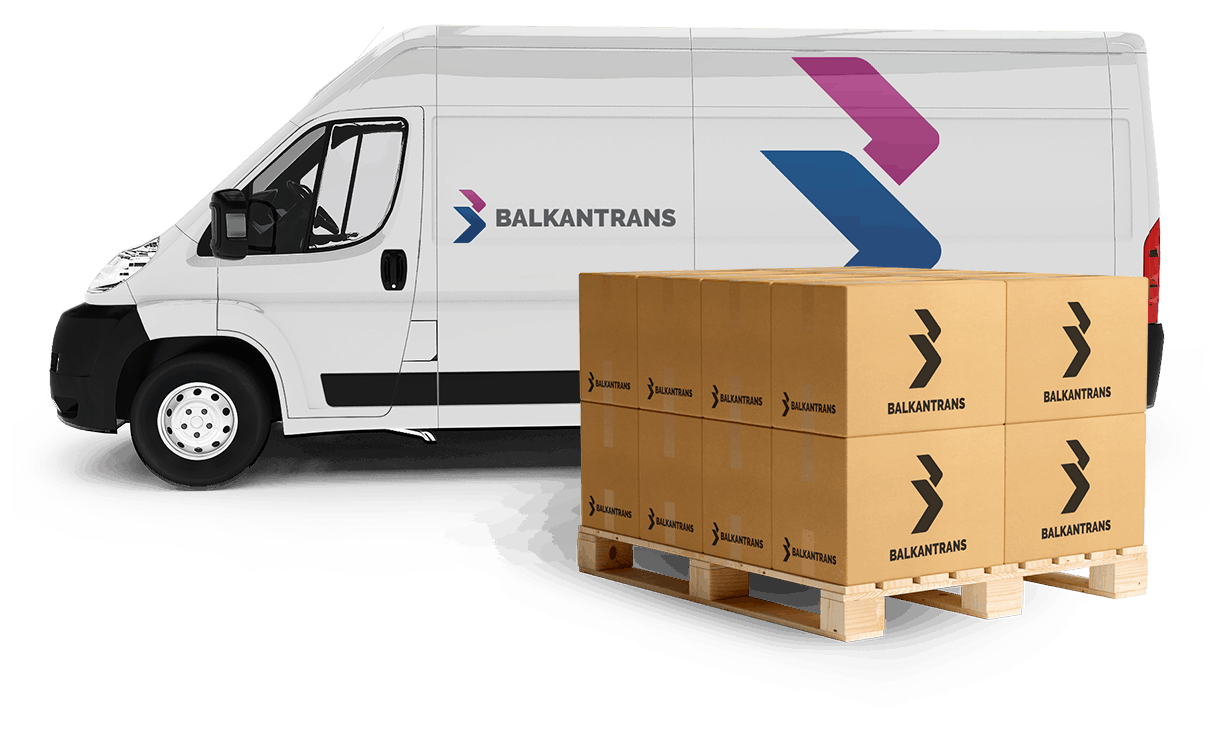
Logo redesign and visual identity creation
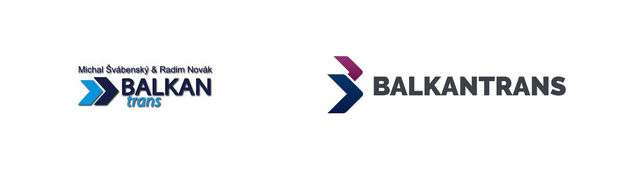
When we were redesigning the visual identity, we tried to maintain consistency with the existing elements, used by the company, and to give it a new and modern touch. In the new design we retained arrows, which indicates the speed of transport, from the previous logo. However, we have organized them into the initial B-letter of the company. This can also evoke migratory birds flying to the Balkans.
The color palette was created based on the values, which the company represents. The primary color of identity is blue, which represents responsibility and reliability. The secondary color is a mixture of red and purple representing enthusiasm and creativity.
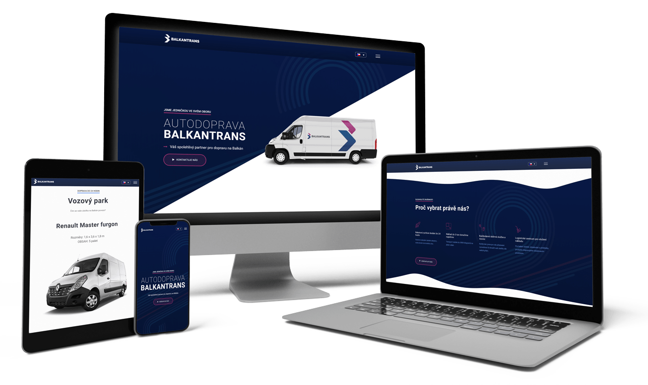
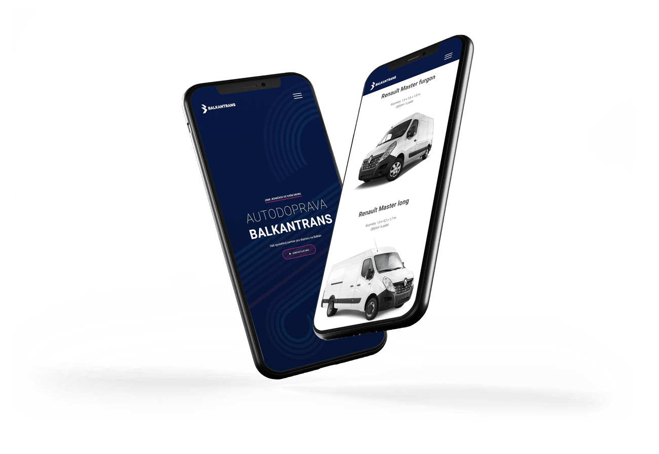
New presentation website
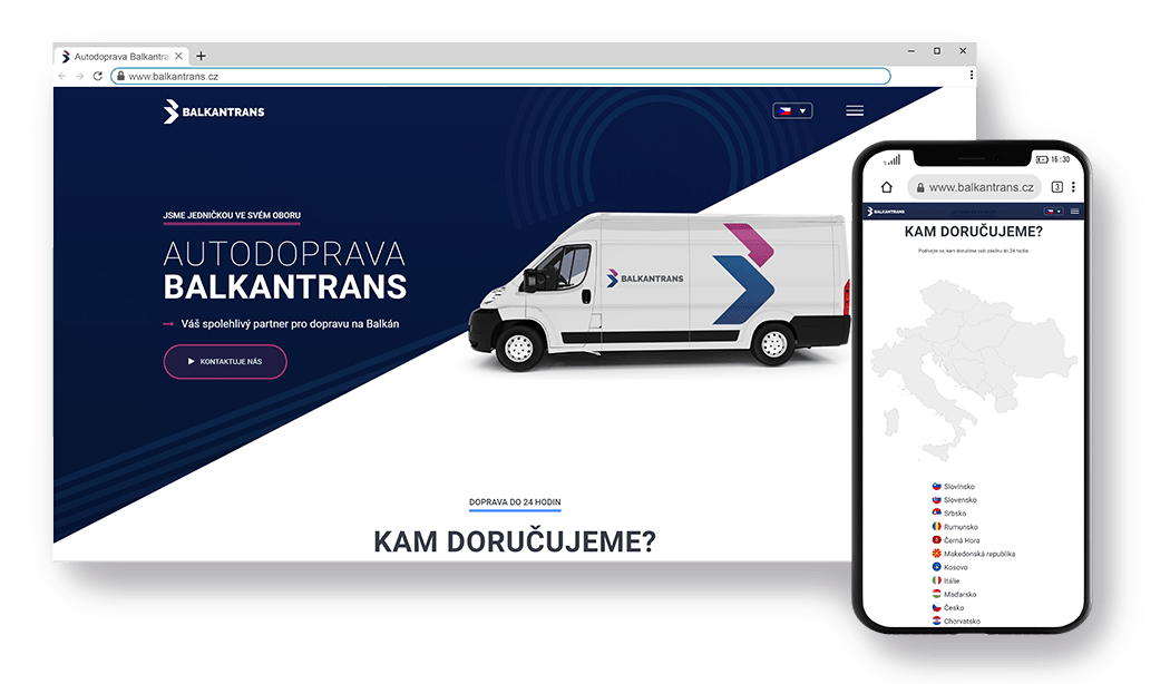
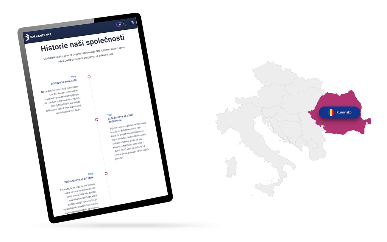
The basic requirement was simplicity, because the company successfully worked and grew without online presentation. We have integrated into the design of the company’s new presentation websites an interactive map of the countries, where the company delivers the packages to. Cause we want to give visitors the most important information without extra steps.