REFERENCE: REDESIGN AND NEW WEBSITE FOR A TRANSPORT COMPANY
Redesign of the visual identity of the carrier Balkantrans
Balkantrans specializes in transporting shipments to and from the Balkan countries. The owner of Balkantrans approached us with a request to redesign their visual identity and create a new company website. And how did we do it?


VISUAL IDENTITY
A thorough redesign with attention to detail
When redesigning the visual identity, we tried to maintain consistency with the existing elements that the company was already using and give it a new modern touch.
VISUAL IDENTITY
And the result? Fresh and engaging!
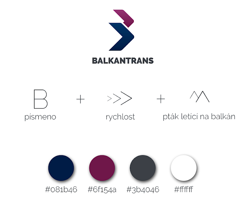
In the new design, we kept the arrows from the previous logo, symbolizing delivery speed. However, we arranged them into the company’s initial letter B, which – when flipped – also evokes migratory birds heading towards the Balkans.
The color palette was created based on the company’s values. The primary color is blue, representing responsibility and reliability. The secondary tone is a blend of red and purple, symbolizing passion and creativity.


WEBDESIGN
A new website for a new identity
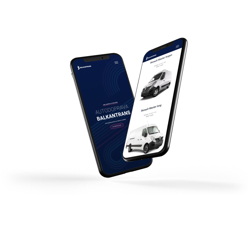
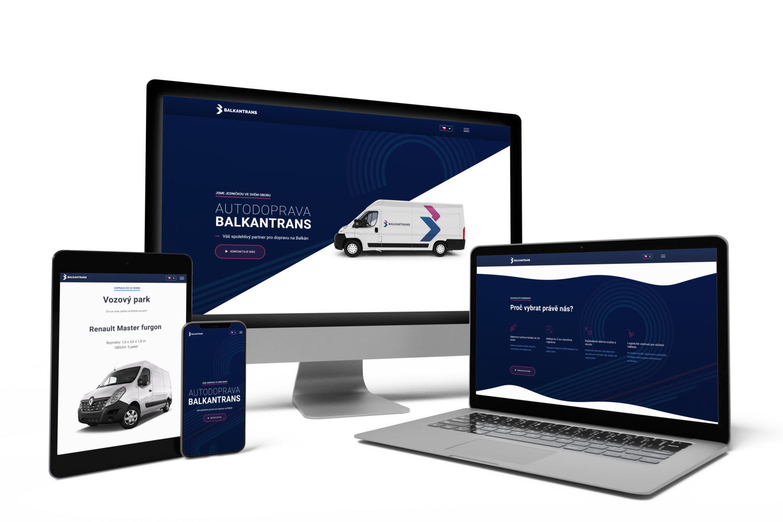
The key requirement was simplicity, as the company was successfully operating and growing even without an online presence. In the new presentation website design, we incorporated an interactive map of the countries to which the company delivers, so visitors can instantly see the most important information without endless searching.

What about the client?
Petr Švábenský
Founder of Balkantrans


“I approached Krejta with a request to redesign our web identity. My main requirement was simplicity. I really like how the Krejta team handled this task, and I’m very excited about the new logo design. I can only recommend them.”


